LOGOTYPE REDESIGN
The National Christian Choir is an interdenominational choir, based in the Washington DC metropolitan area which ministers through concerts, recordings, tours, and radio both locally and in various parts of the United Sates, and occasionally internationally.
My goal was to redesign the logotype using fully custom lettering to evoke a more welcoming and modern personality of the organization and its high quality, established nature. I started off researching the brand and it's audience, while also studying the existing logo and its limitations. The current logo utilizes a title case format which highlights the acronym—NCC—but, falls short aesthetically due to inconsistent characters that follow with the use of a different typeface. In the update, I illustrated script-style letterforms to create a more cohesive and friendlier look.
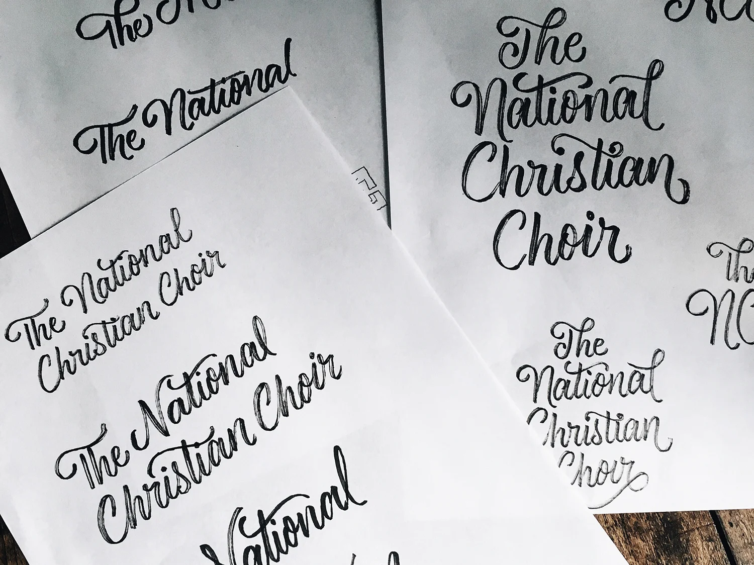
SKETCH DEVELOPMENT
I decided to use several variations of my brush pen calligraphy to create a whimsical script style. A free flowing, hand written foundation adds a genuine elegance that will allow The NCC's audience to be able to directly relate to the choir.
REFINING SKETCHES
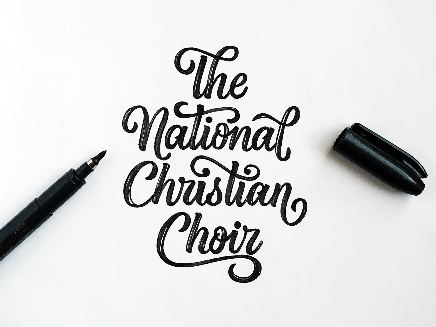
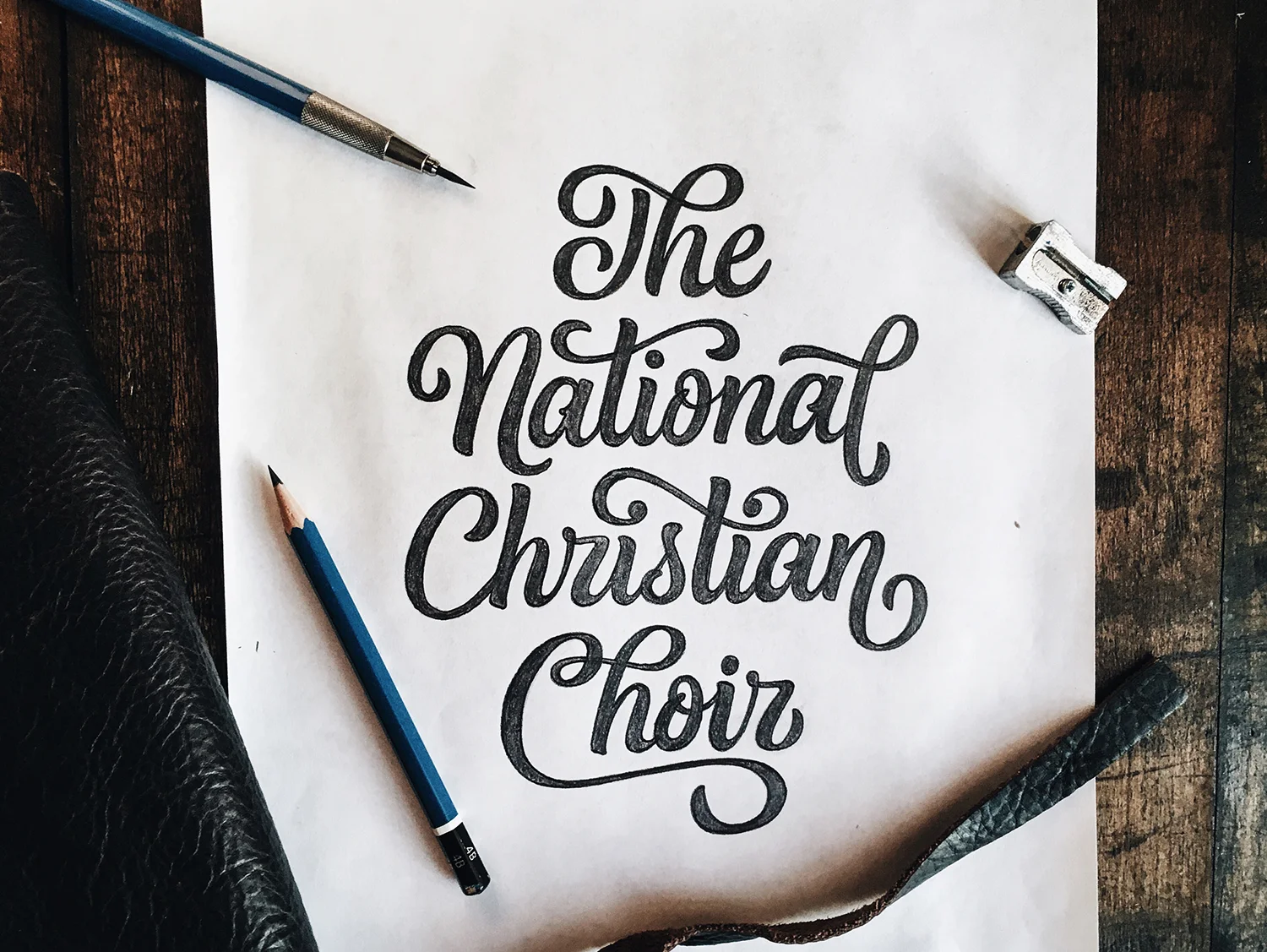
With the general direction in mind, I progressed through several sketch stages to work out the composition and details. I decided to utilize ligatures (the joining of two letters) throughout the design to show harmony and synergy—characteristics that are often practiced within a choir to form a unity among ensemble. Through repetition and muscle memory, I was able to create a cleaner hand-written version with my brush pen. I used a micron outliner to refine the edges of each character to make iterative tracing easier to replicate.
DIGITIZING
Referencing a final sketch—with notes to consider while digitizing the letterforms—allowed for a more efficient process. When vectoring, each letter was individually illustrated to emphasize the personalized, custom hand-drawn nature of the logo. At the same time, consistency is maintained through similar visual shapes throughout, such as the crossbar of the ‘t’, the upper ‘T-h’ ligature and the lower ‘C’ underlining swash. I also carefully balanced either side of the logo by creating similar entrance (national) and exit (christian) strokes within the ‘n’s. It's usually a difficult design problem to solve a logotype with several words that consist of many characters. These elongated crossbars and swashes allow for a cohesive union, negating the excessive whitespace that would naturally occur if the logotype were more structured.
BRAND COLOR
It's important to maintain a brand color when refreshing a logo. The National Christian Choir has a long history of building an audience who trusts a wonderful experience through a beautiful performance. When your audience envisions The NCC, they will always think of the blue robes, blue logo and blue identity collateral. Brand recognition through the use of color is extremely powerful. If we drastically changed the color, those years of expectations would be altered and a new identity would need to be built from an entirely different foundation.
I explored a different variation of The NCC's current blue and landed on a brighter hue so to infringe on the brand perception significantly less than if we went with a different color. This blue is a tint (mixture of white) of the choir's current blue. Brightening the color adds a more welcoming and friendly feeling.